This project connects to my dissertation research on anti-gentrification activism. From February 2016 to February 2018, I used the Social Feed Manager application developed by George Washington University Libraries to collect tweets in real time from Twitter’s API. Over two years, I collected approximately two million tweets (with associated metadata) containing the keyword “gentrification”. I formulated additional tweet collections around activist groups identified in the initial gentrification collection.
To begin to understand this very large dataset, I used R to generate word count and bigram visualizations from a random sample of 200,000 tweets from February 2016 - February 2017. (Read more about how to do this in Kris Shaffer’s code in “Mining Twitter data with R, TidyText, and TAGS”.

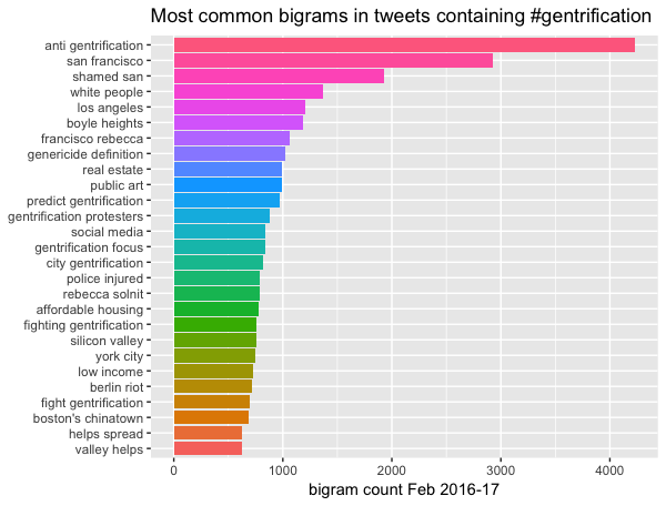
The bigram visualization helped me see patterns not present in the word count visualization and became a starting point to identify themes like anti-gentrification resistance and the role of art in gentrification. The bigrams also allowed me to isolate particular locations like Boyle Heights, Los Angeles, which would eventually constitute the primary case study in my dissertation.
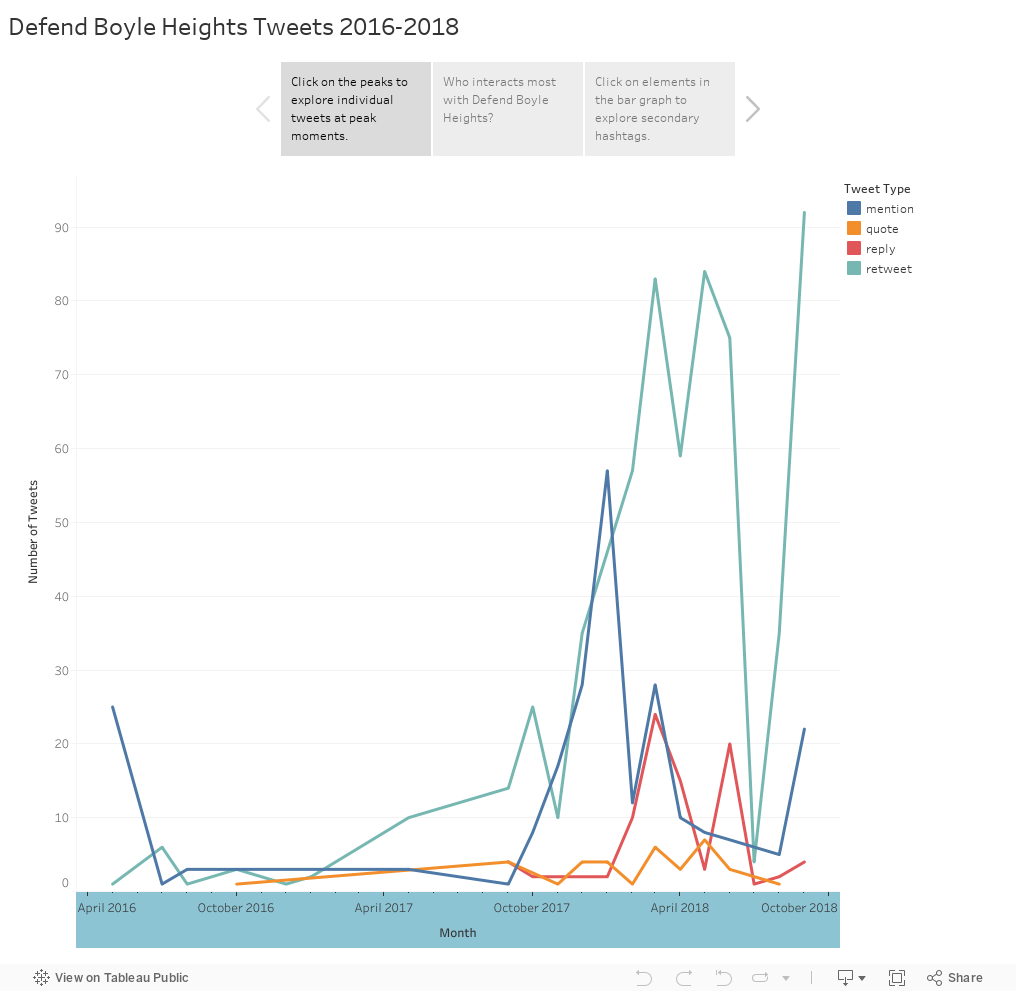
To help contextualize some of the patterns in the above visualizations, I used Tableau. Through various graphs, Tableau helped identify quantitatively significant elements of the dataset such as viral tweets, the most active users, and important peaks in activity, while also allowing me to explore the granular data and tweets that underlie these quantitative measures.
In the Tableau story below, I analyzed only the Defend Boyle Heights activist data from the larger dataset. By doing so, I was able to understand these tweets within the larger ecology of gentrification tweets. Equally as important, Defend Boyle Heights’ narrative began to take shape through this data analysis and subsequent other methods of research.
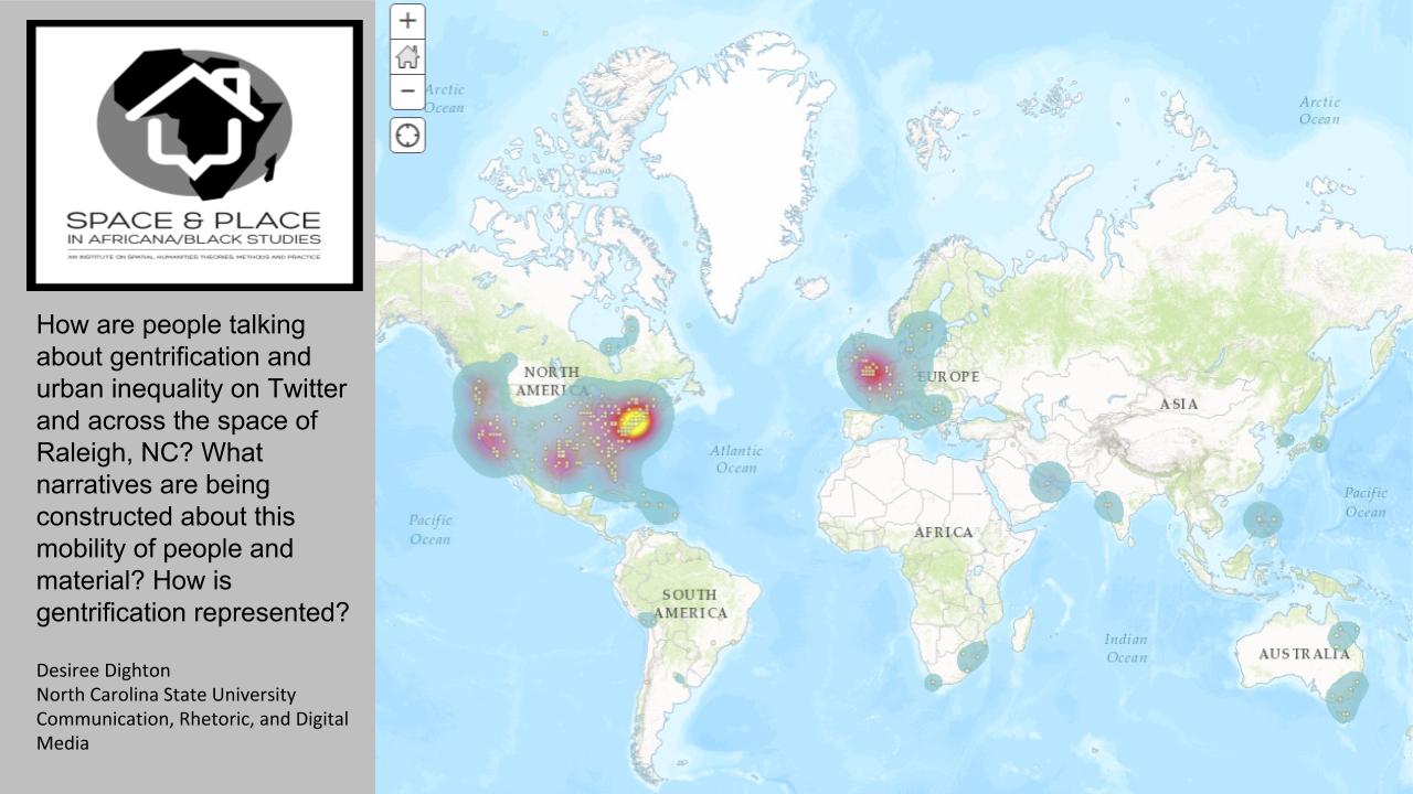
Similarly, I used mapping to help flesh out stories within the larger dataset. In early efforts, I used ESRI’s ArcGIS Online to map a small geolocated sample of tweets (about 80,000) from my larger data collection during Summer 2016 NEH ODH Institute for Advanced Topics in the Digital Humanities Space and Place in Africana/Black Studies: An Institute on Spatial Humanities Theories, Methods and Practice for Africana Studies. The visualization demonstrates the global spread of the Twitter discussion about gentrification. Unsurprisingly, tweets are most concentrated in urban areas most commonly associated with gentrification, such as New York City, Washington D.C., and London, England. The map also reveals that discussions of gentrification have spread to the Global South, dappling significant areas in South America, Africa, and Asia.
To explore this data’s relationship to more organized activism, I human coded the Twitter data related to the Latinx anti-gentrification coalition, Defend Boyle Heights (DBH). Many of DBH’s tweets are geolocated, but to improve the accuracy of the location information as well as to trace the movement of DBH through a new materialist lens, I read and human-coded over 1,000 tweets, reading attached images and other media to identify precise locations and activities. The early version of this map partially demonstrates DBH’s movement and encounters from 2016-2018, providing implications for how we understand circulation as an assemblage of human, material, and technological processes. On the current map, points bunch together to indicate the presence of numerous tweets referencing the same location and demonstrates the concentration of physical and digital energies encountering each other at these locations.
In future iterations of the map, I will incorporate symbology to distinguish between incoming art galleries and other gentrifying businesses, the places made vulnerable by eviction and rising rent prices, and the community centers and murals that reflect Boyle Heights’ Latinx cultural identities and Chicanx histories. Mapping DBH demonstrates the way in which this group makes visible gentrification’s ties to cultural erasure and human displacement. By including symbols that show DBH’s contribution to gallery and business closings, it also demonstrates how DBH circulates within physical and digital spaces to compose and retain Boyle Heights as a space that reflects situated cultural and economic values. Mapping DBH’s followers demonstrates how DBH circulates beyond their Los Angeles neighborhood to build alliances based on a sense of shared heritage and political goals.
The code used to prepare data for the maps and create graphs is available on Github.